Eated
Remote
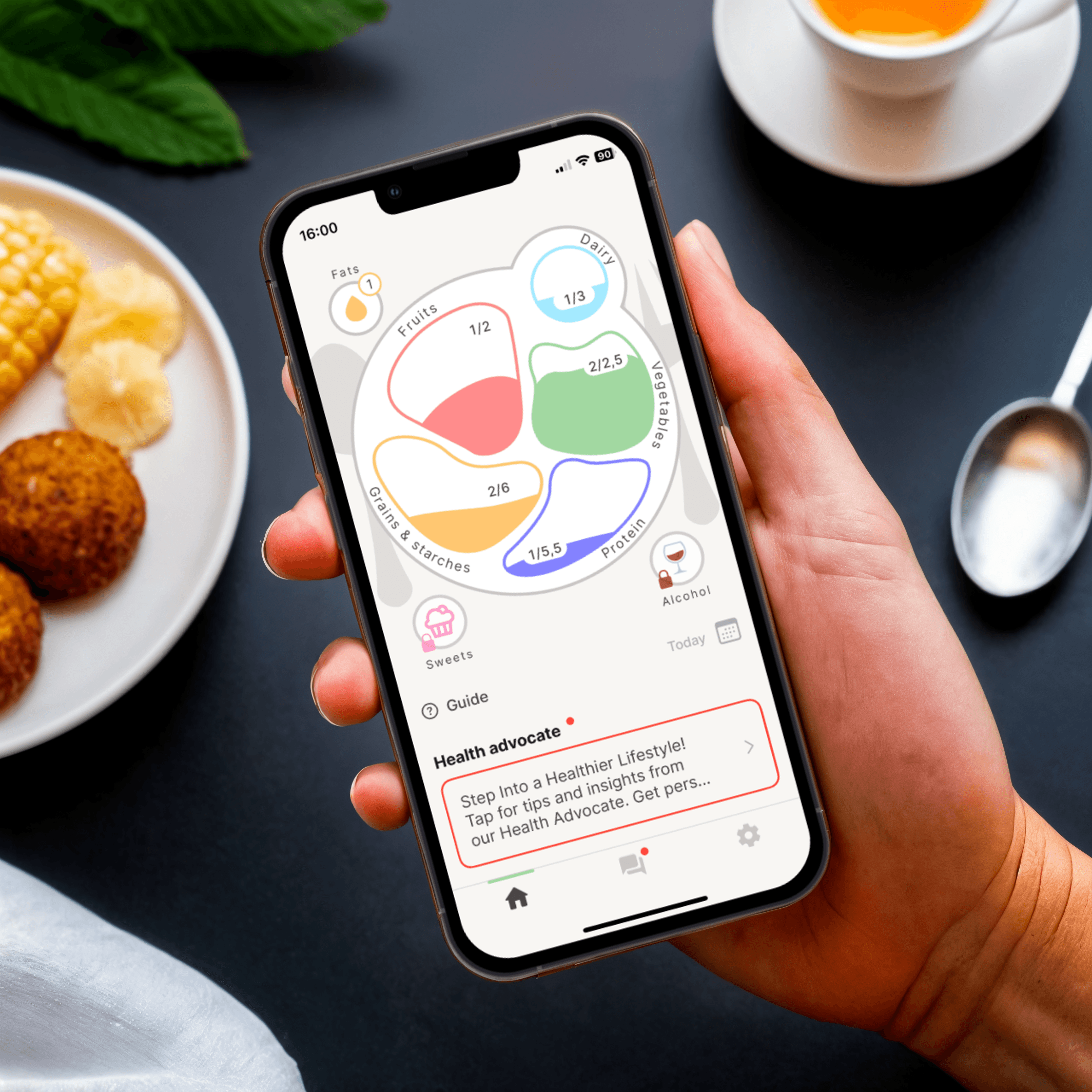
Inspired by the founders' journeys, Eated is an iOS Food & Nutrition Tracker app that helps users develop sustainable eating habits without calorie counting.
Overview
This case study showcases redesigning the app's core features to address key pain points, enhance user satisfaction, and support business growth.
About Eated
Eated is a small startup helping users make healthier choices with evidence-based methods and personalized health coaching. This case study covers the redesign of three key features:
This case study showcases the redesign of the app's core free features:
Balanced Method - personalized portion recommendations based on activity, weight, and height.
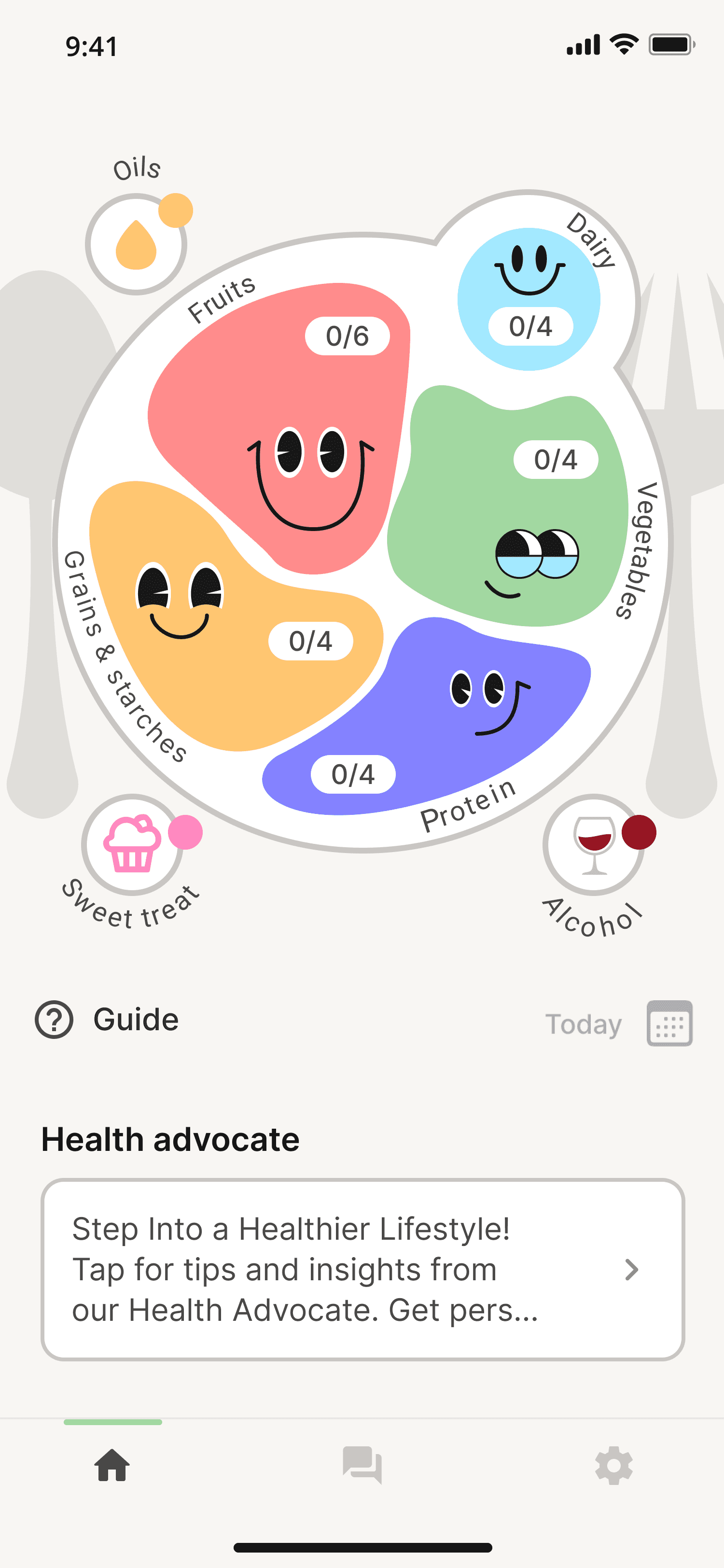
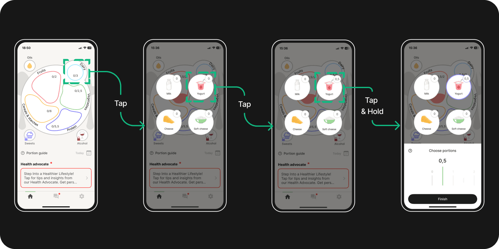
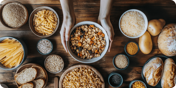
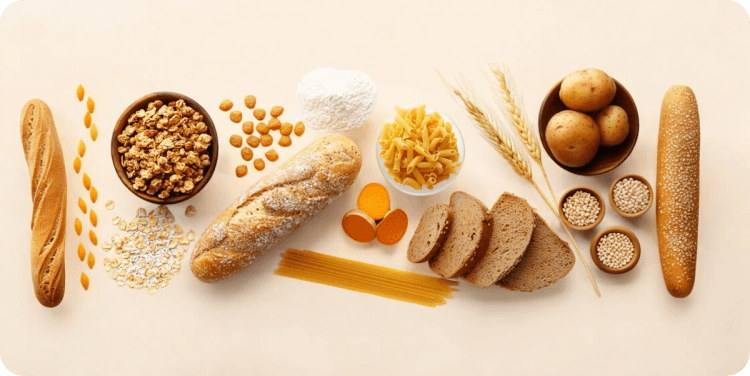
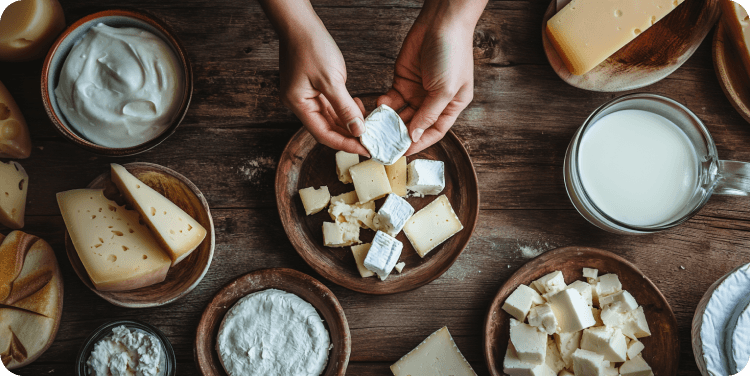
Food Tracking - track food types like grains and proteins without calorie counting.
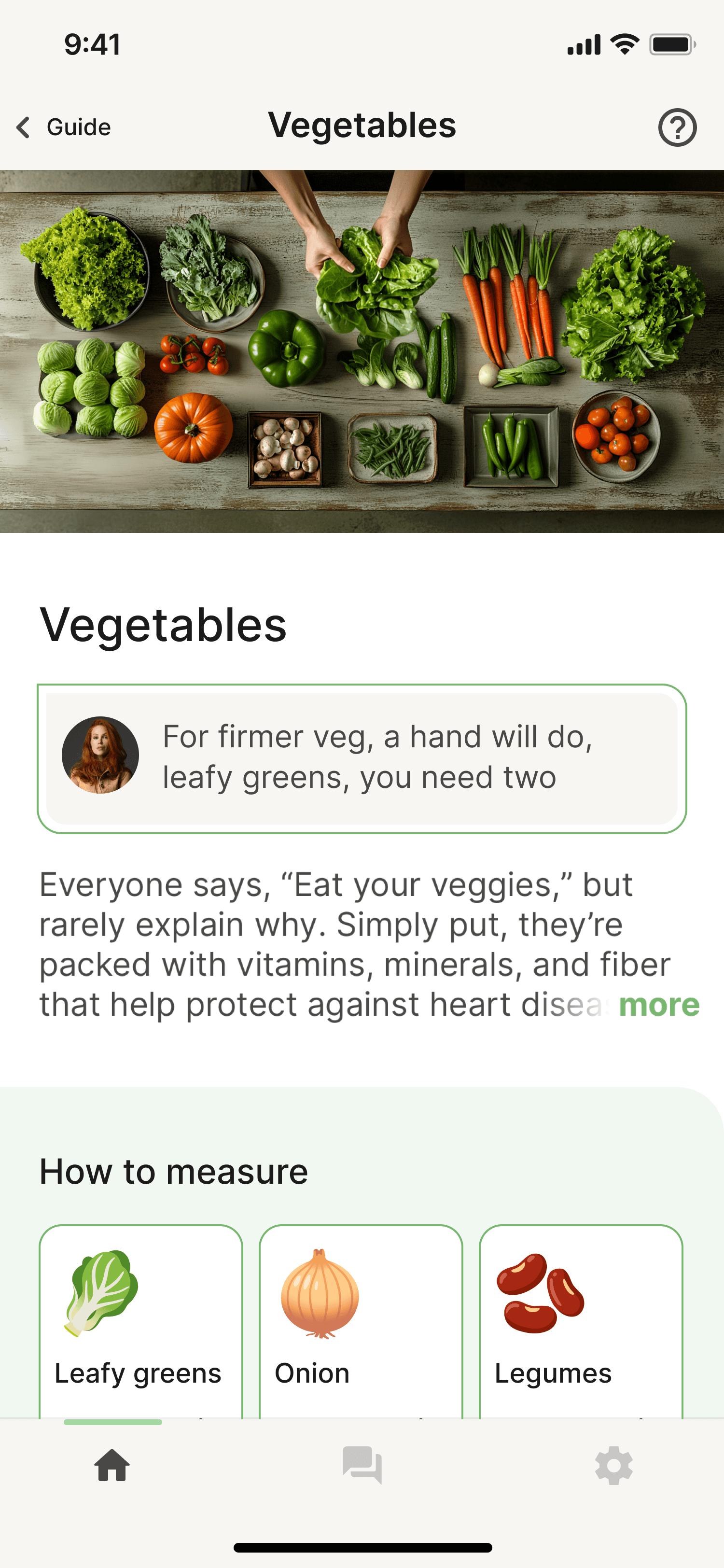
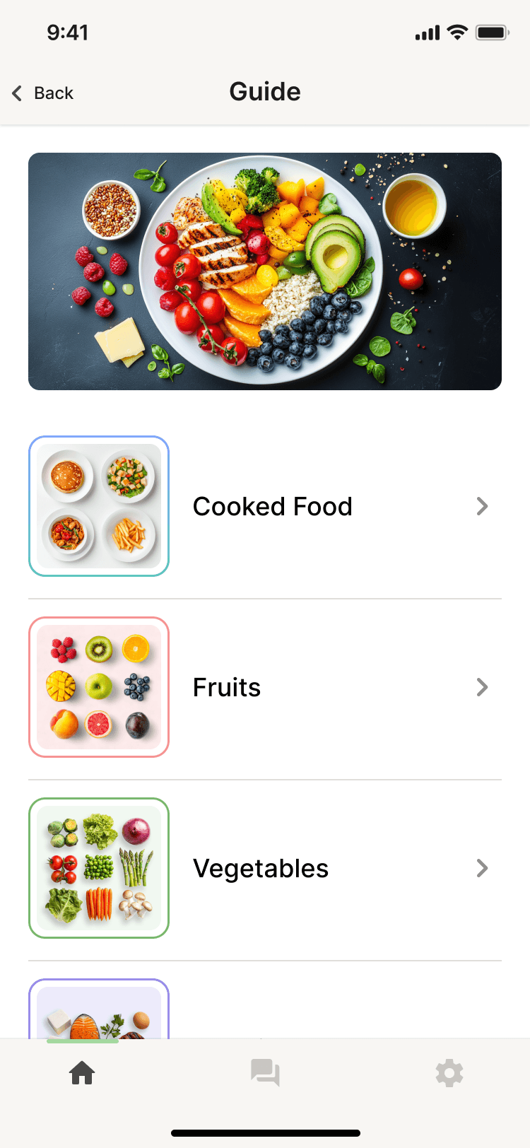
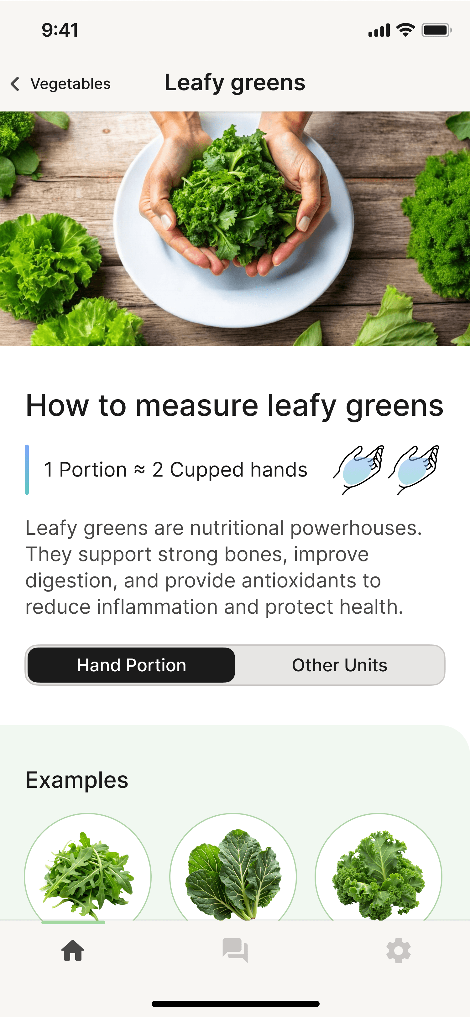
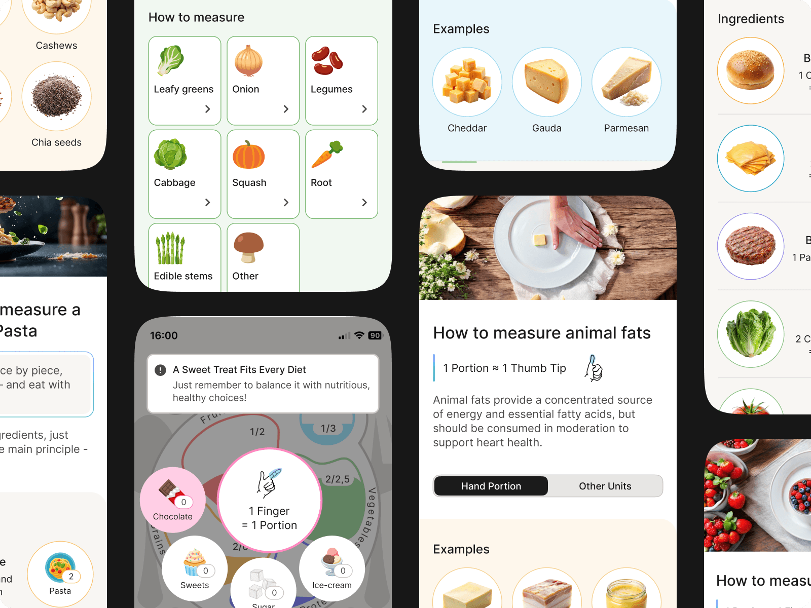
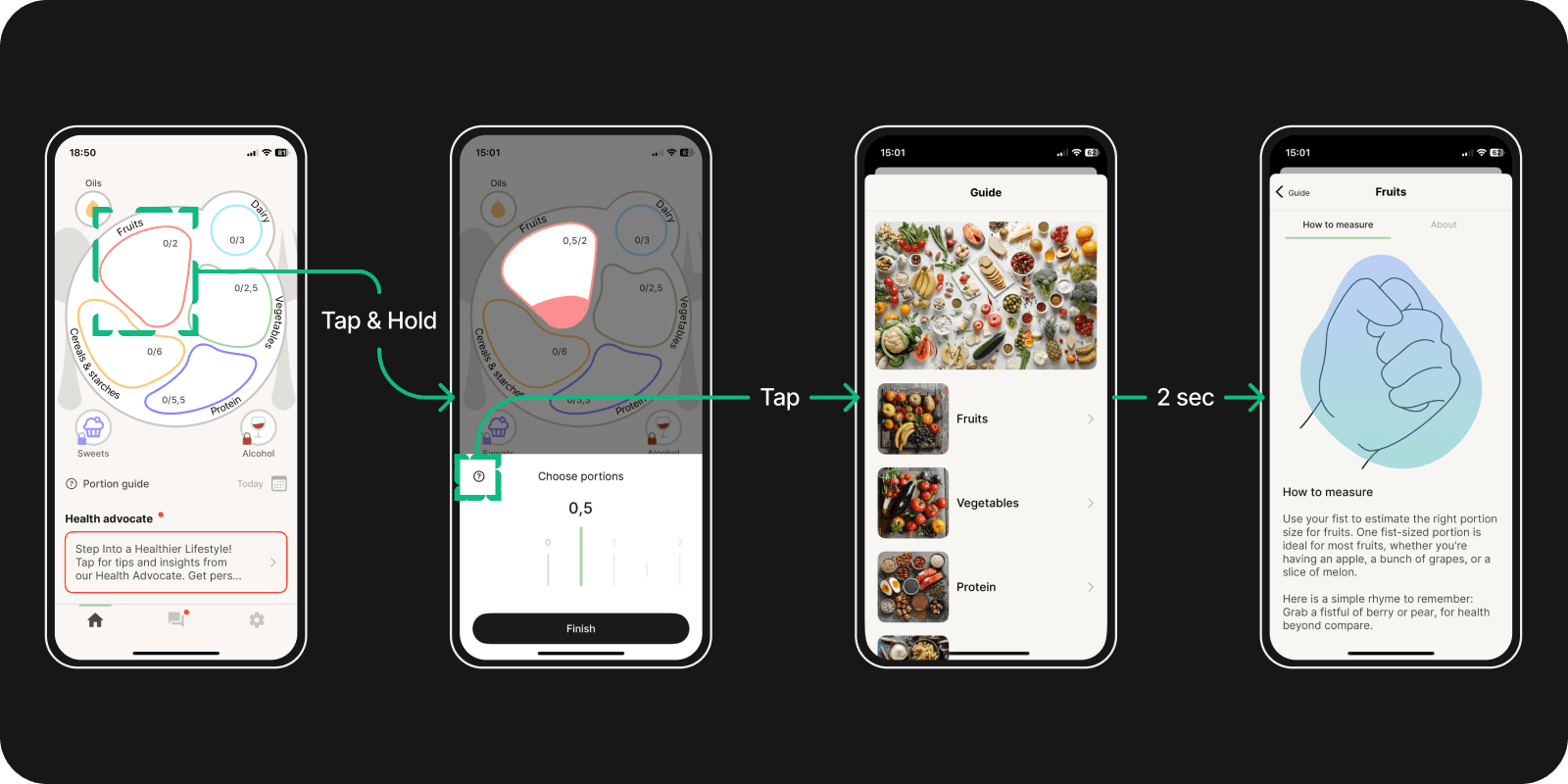
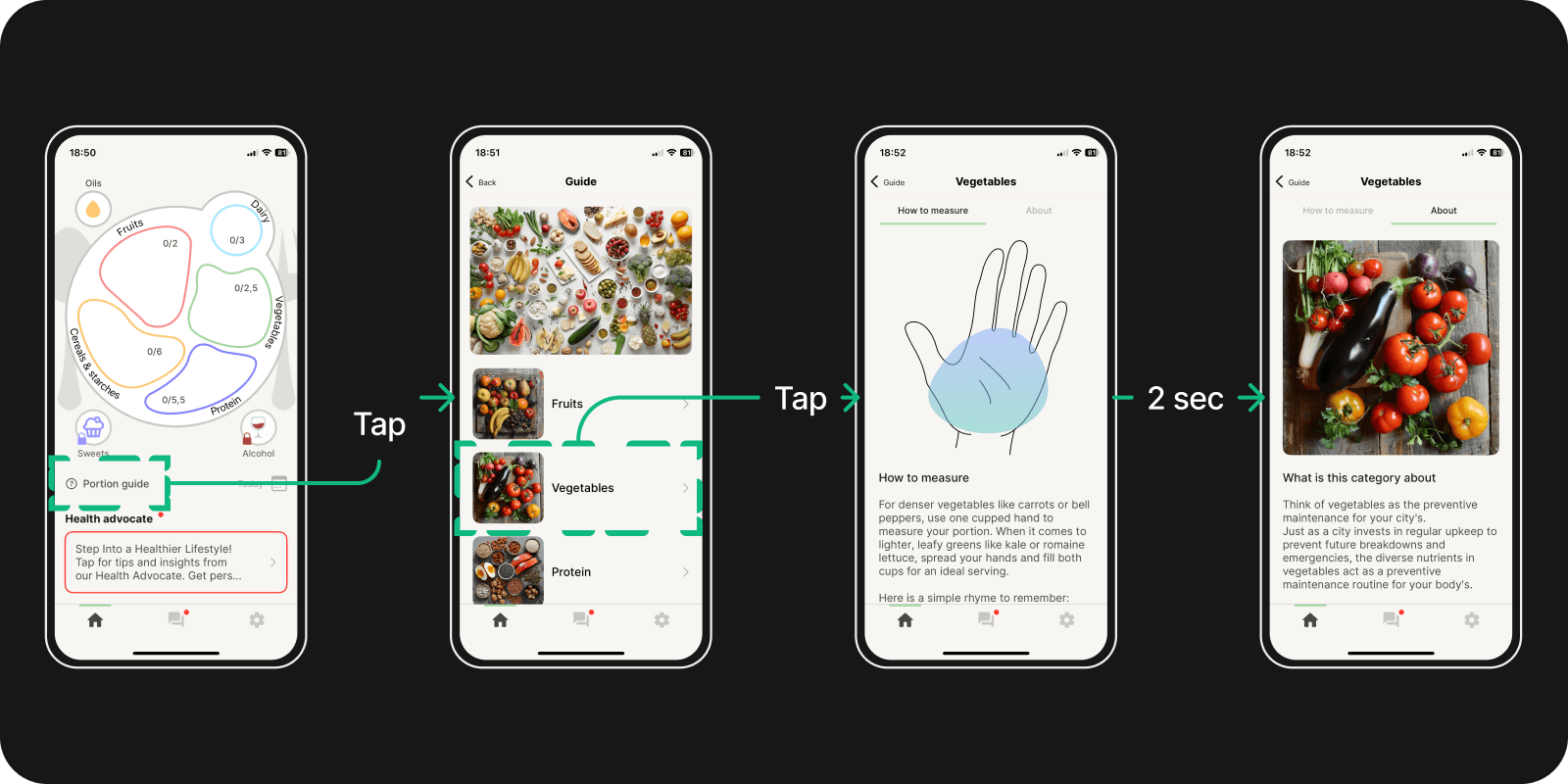
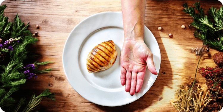
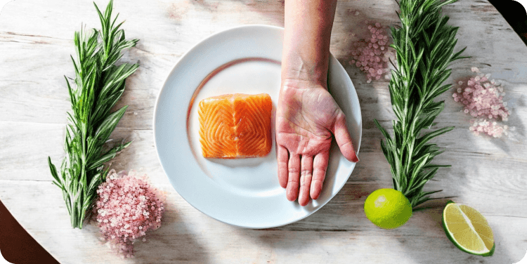
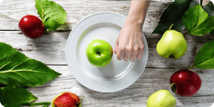
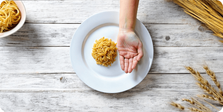
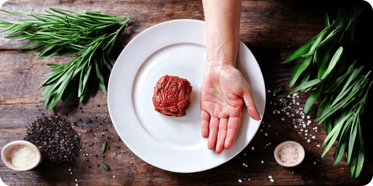
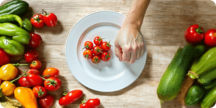
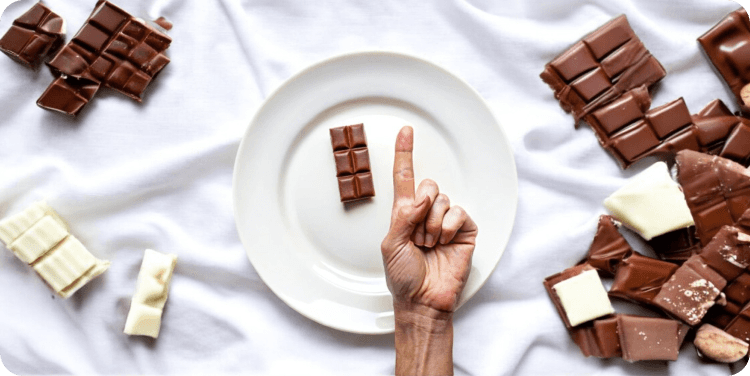
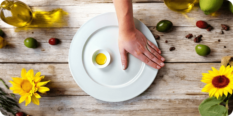
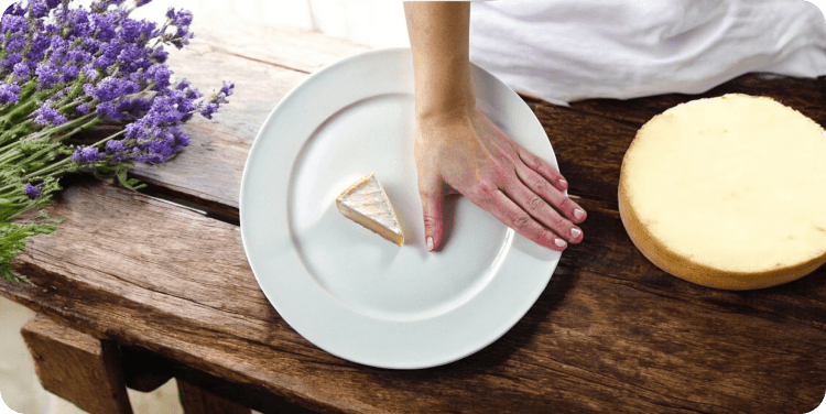
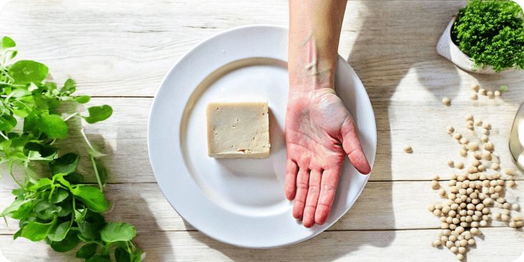
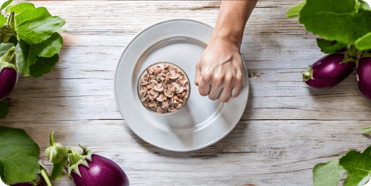
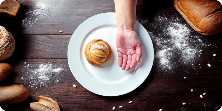
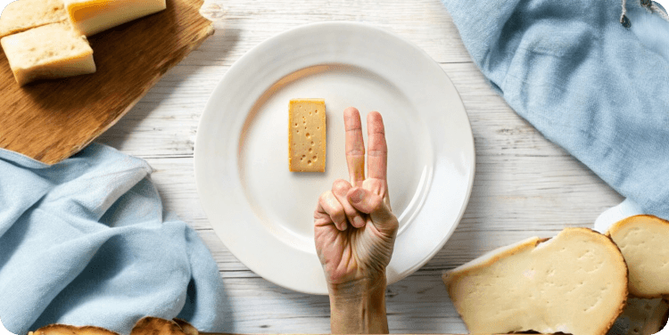
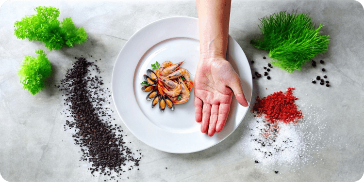
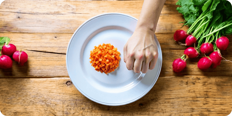
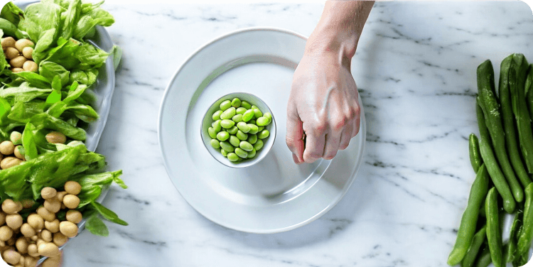
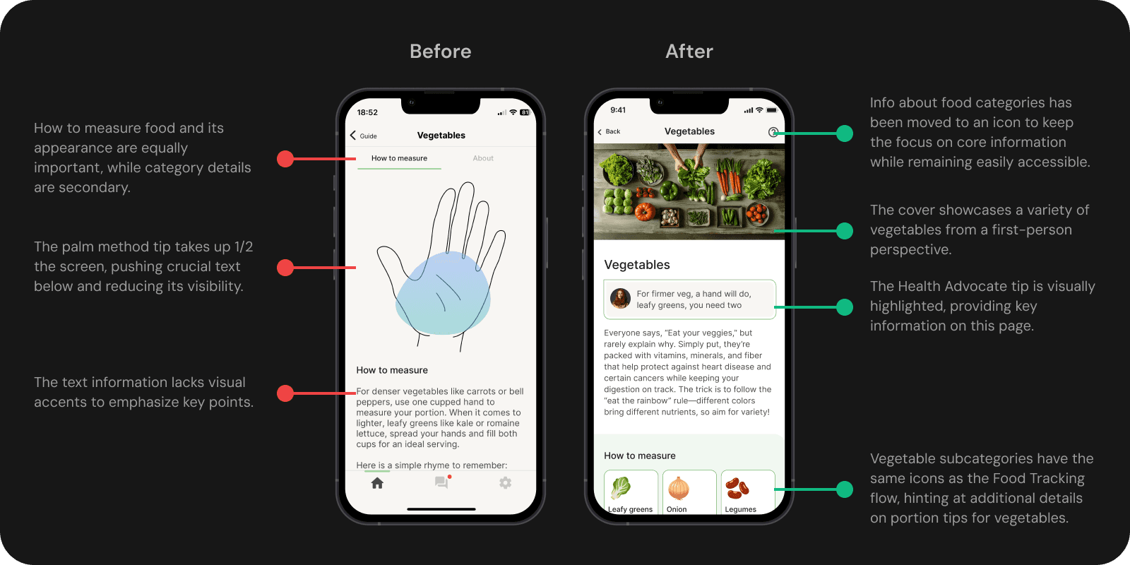
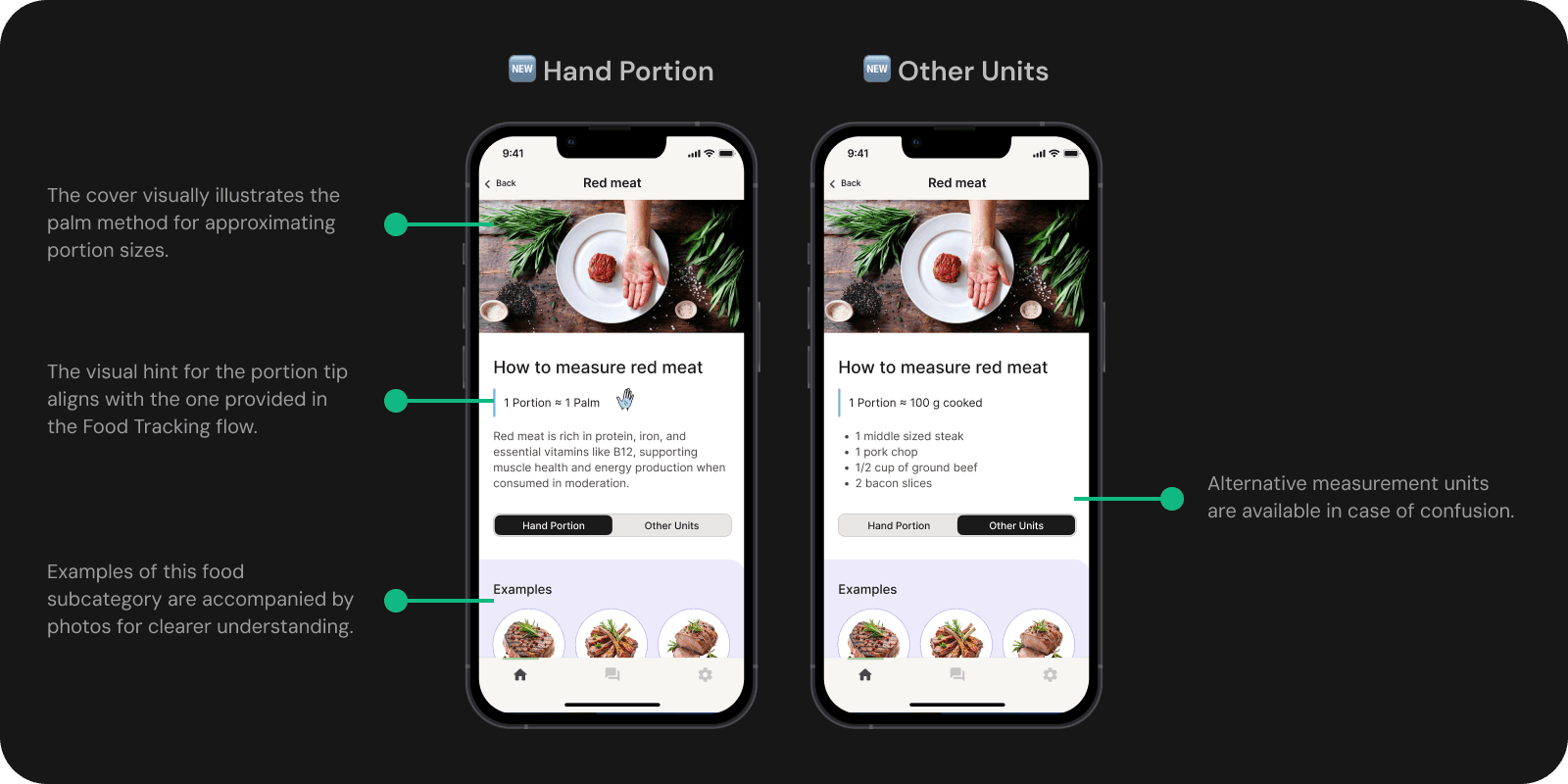
Portion Guide - a visual tool for estimating portions with simple examples.
* One of our founders once called us 'bunnies' 🐰— a tender Ukrainian way to address someone. I made this short video to celebrate that moment and boost team spirit!✨
Leading the Way: Founding Designer Magic
In this project, I led the entire design process from concept to execution. As the sole Product Designer, I took full ownership, from competitor analysis to high-fidelity prototypes, delivering a scalable, user-friendly design.
Key Flows UPD
Screens
+
AI Visuals
Impact
By improving user experience and aligning with client goals, this work set the stage for future updates, driving both short-term value and long-term business growth.
We boosted installs by promoting the redesign and inviting users to experience the new, easier flow.
Retention improved as fewer users dropped off due to confusion, and we saw an increase in session duration per device, indicating users were spending more time in the app.
x
Installs
x
Day 1 Retention
+
%
Session/Device
Research
Based on client feedback highlighting recurring pain points and clear business needs, I moved straight to designing a solution without further research, as it was unnecessary at this stage.
02
User Journey
I mapped flows for meal logging and for searching portion guide tips. Key Pain Points Discovered:
Ambiguity in Portion Sizes: Unclear portion sizes during meal logging.
Lack of Clarity on Food Types: Confusion when logging cooked dishes and distinguishing food categories.
Minor Issues: Inconsistent messaging, unclear icons, and disruptive navigation.
These insights will guide the development of more effective design solutions.
Ideation
05
Food Logging Concepts
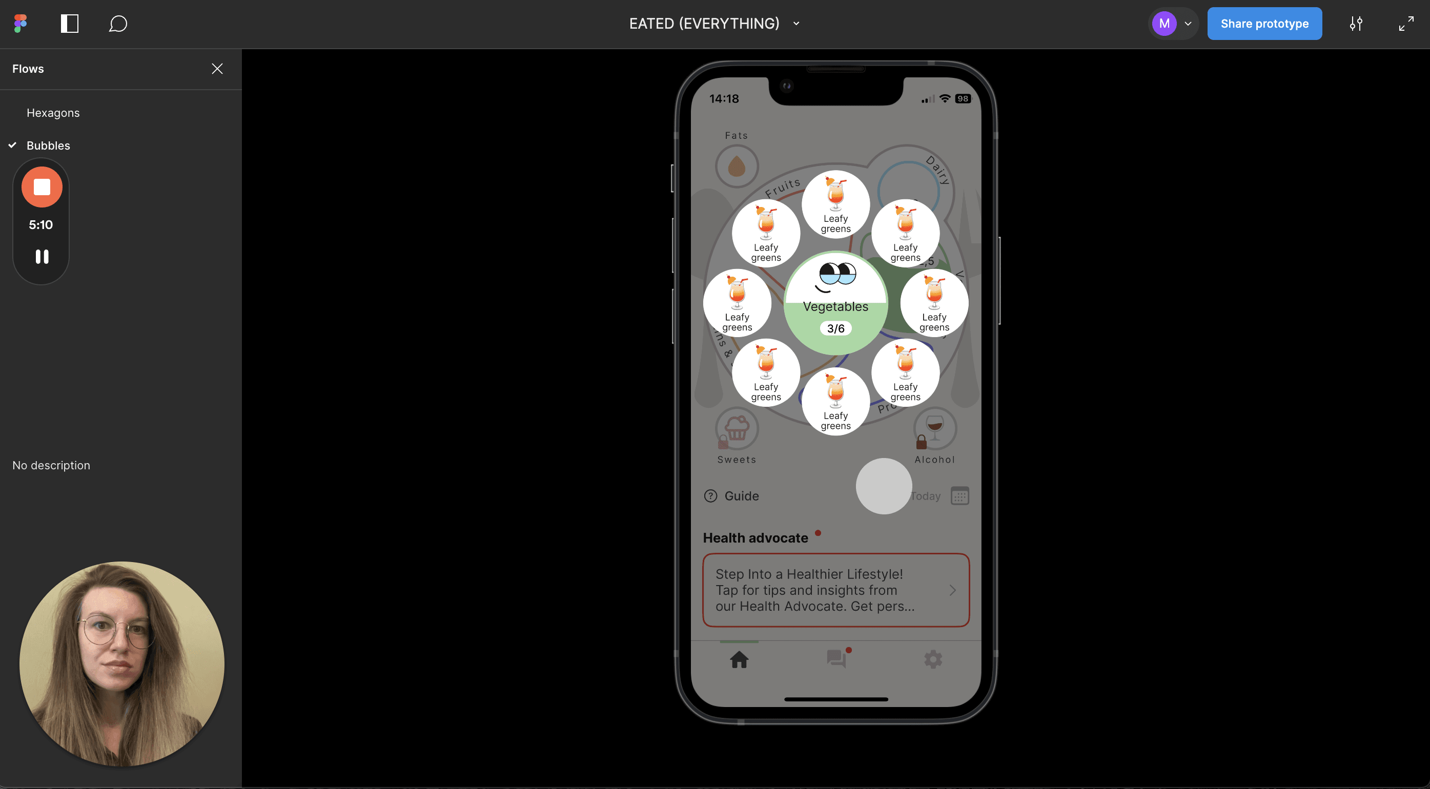
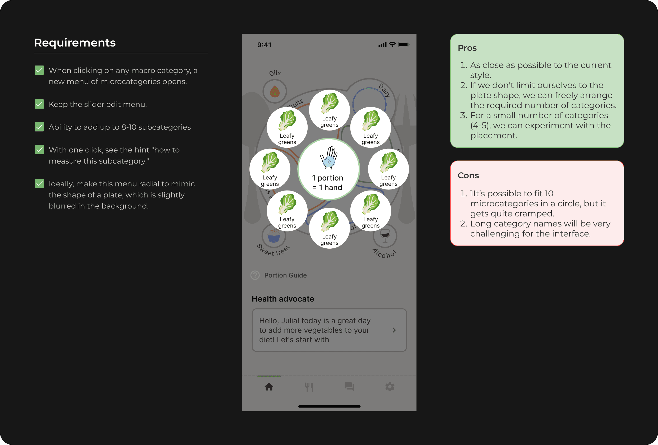
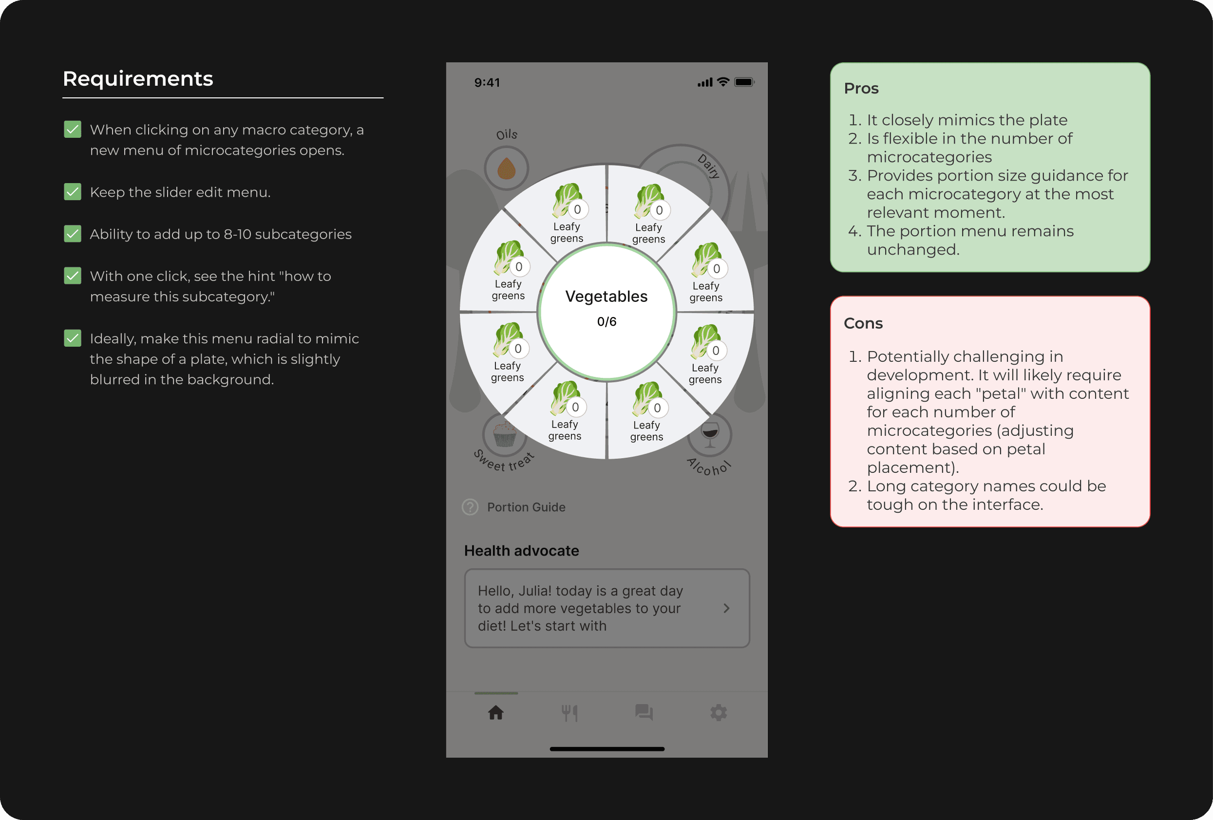
Three design concepts—Plate, Bubbles, and Hexagons—were created as lo-fi prototypes using existing components. Each was presented with its pros and cons to highlight how it meets the requirements.
A Loom video was recorded to explain the concepts, with links to design files and prototypes for easy access and efficient feedback.
06
Portion Guide Concepts
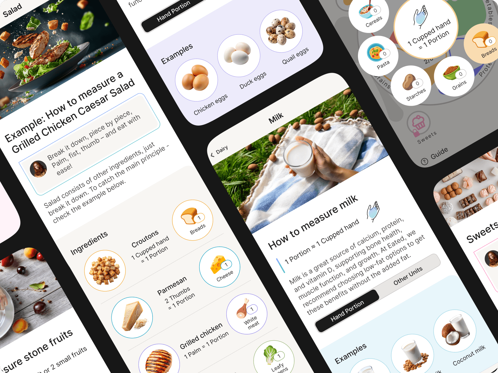
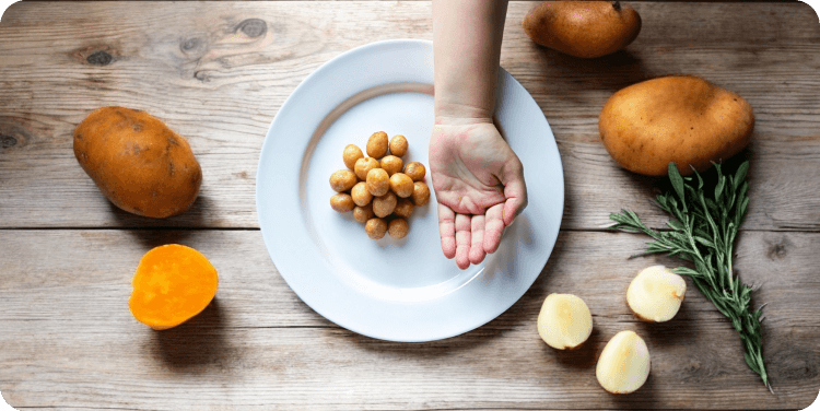
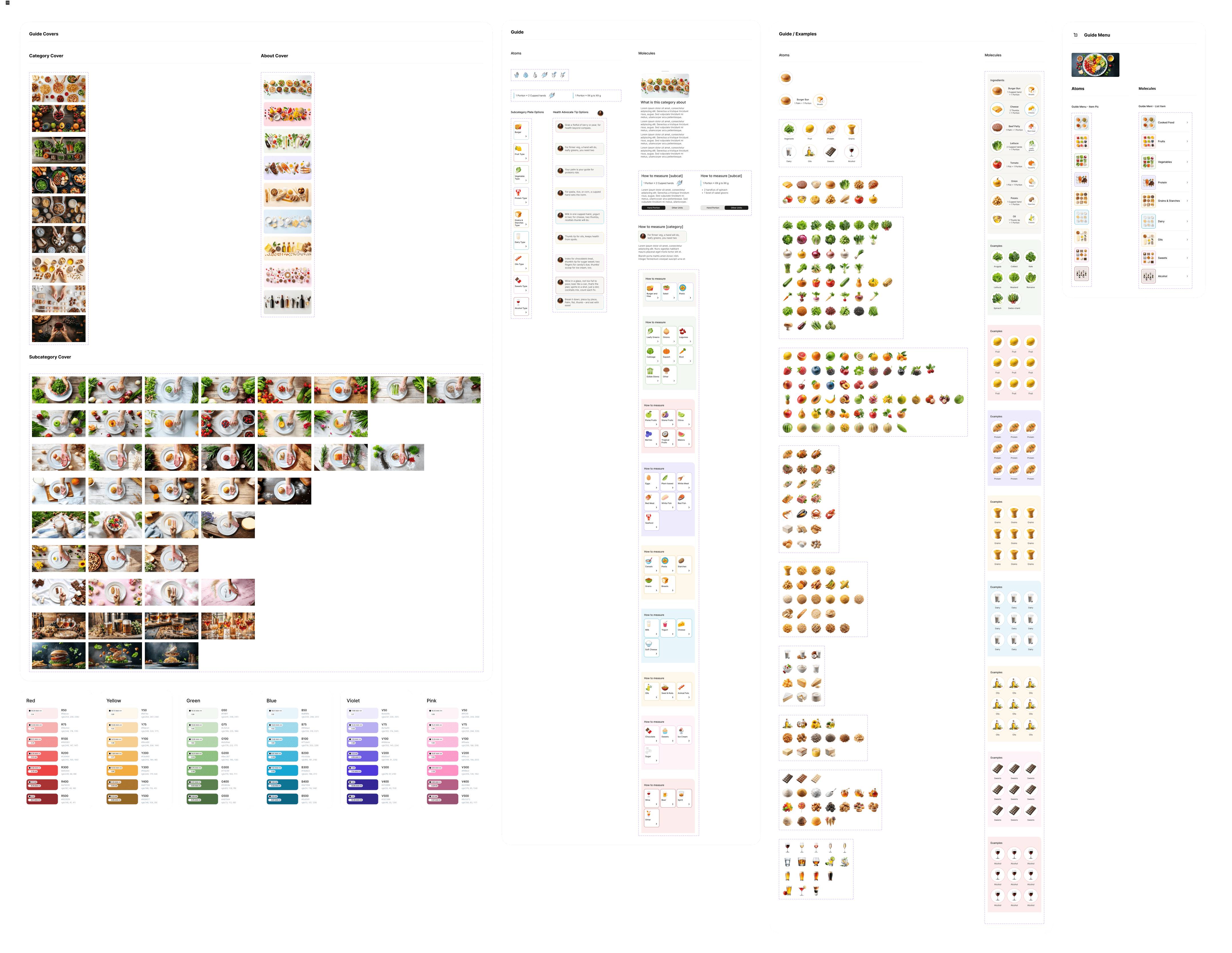
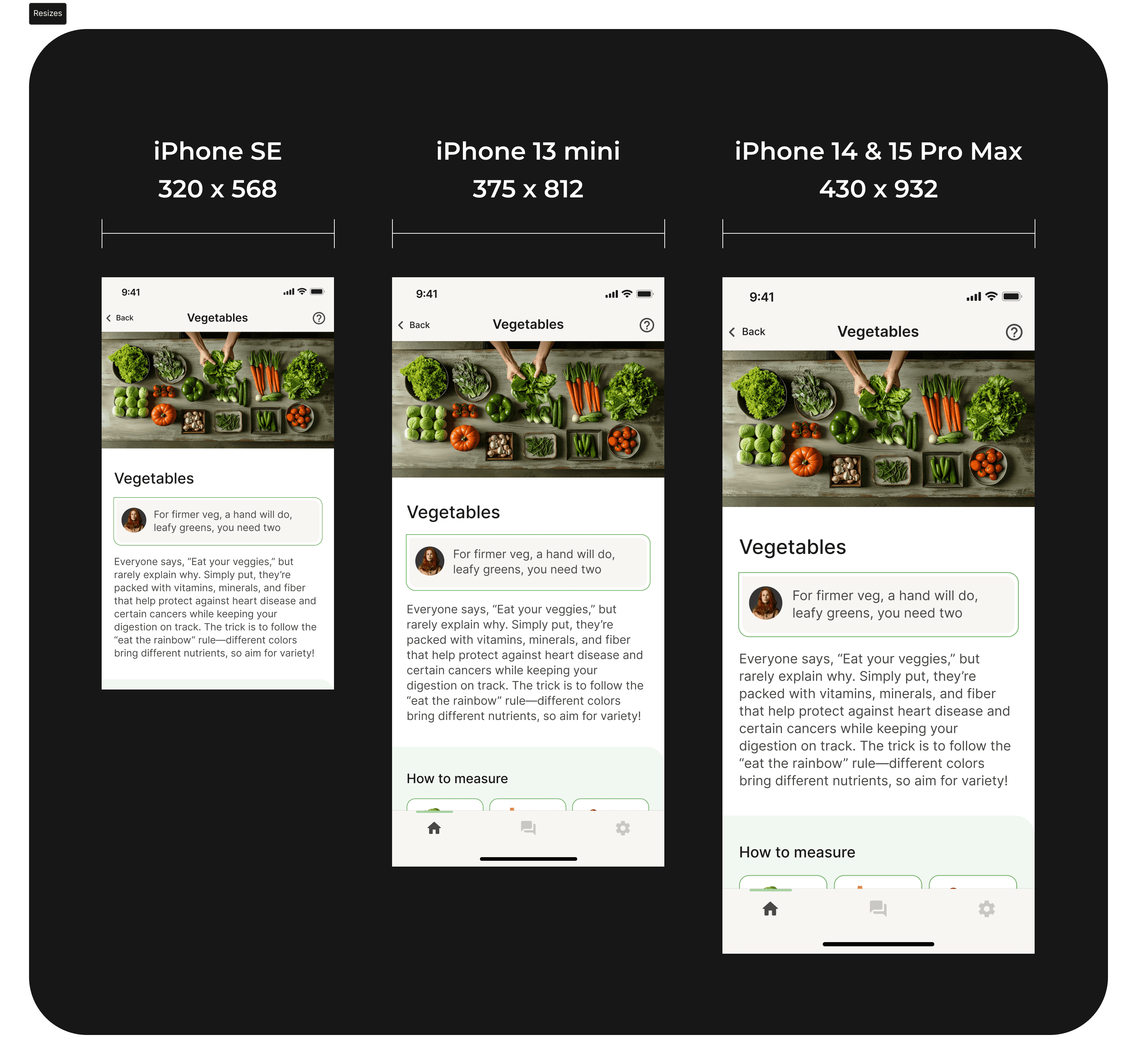
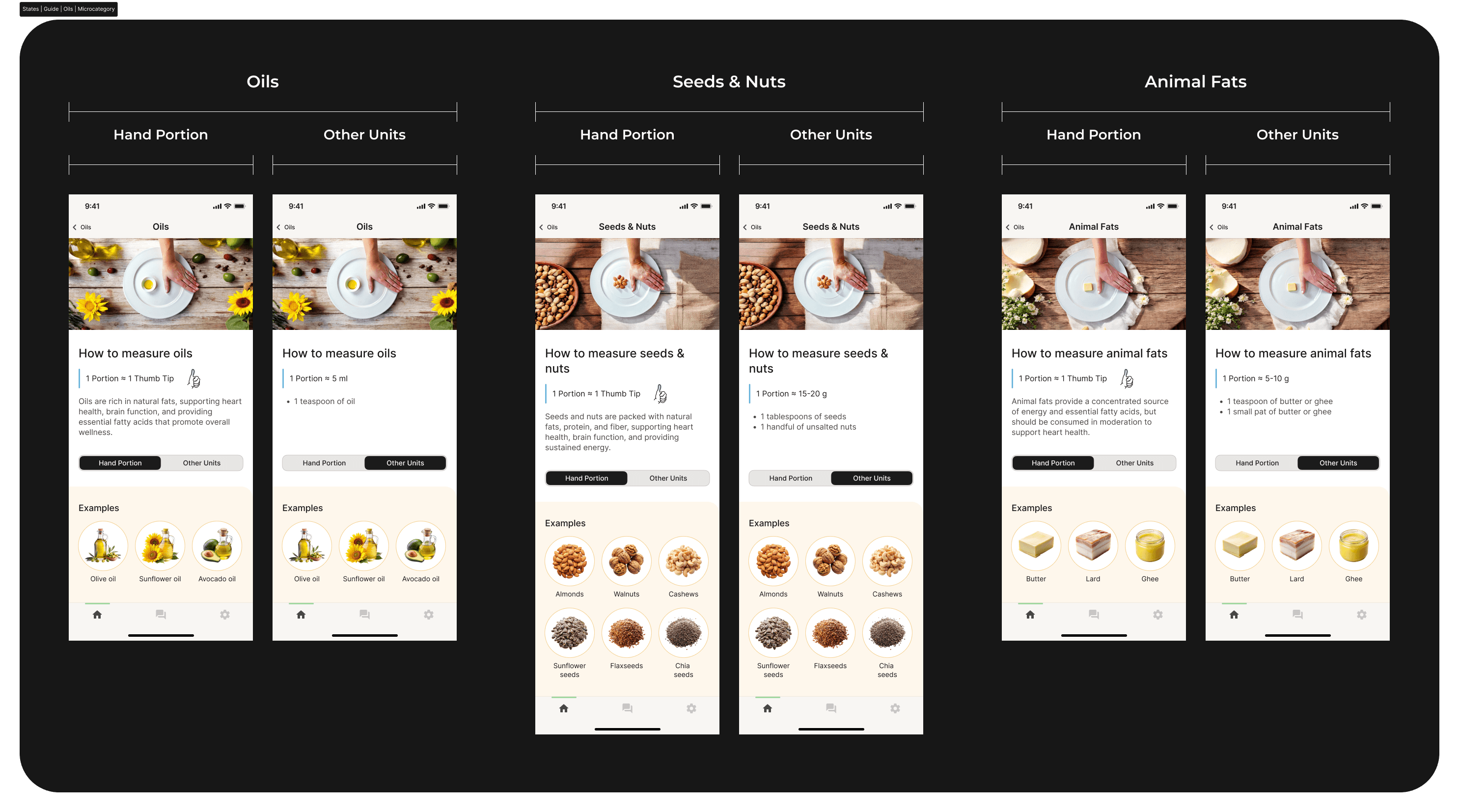
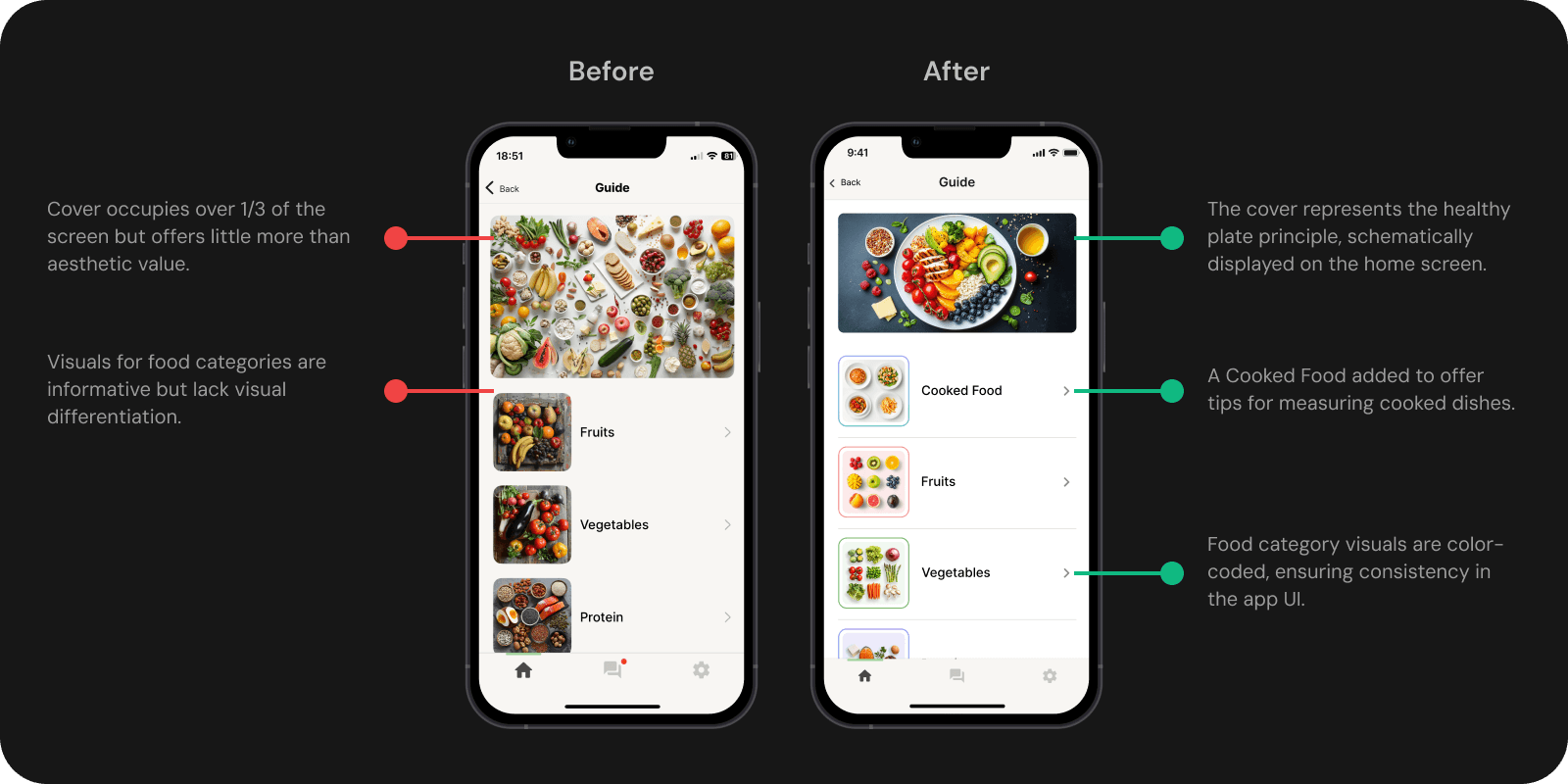
The Portion Guide includes lo-fi mockups designed to improve navigation and help users log cooked meals. The new cooked food category offers clear guidance on portion sizes, while concepts for visual support using the palm method and tips on other measuring options enhance user understanding.
Design
Reflection
11
Impact
The work laid the foundation for future upgrades, delivering key user experience improvements:
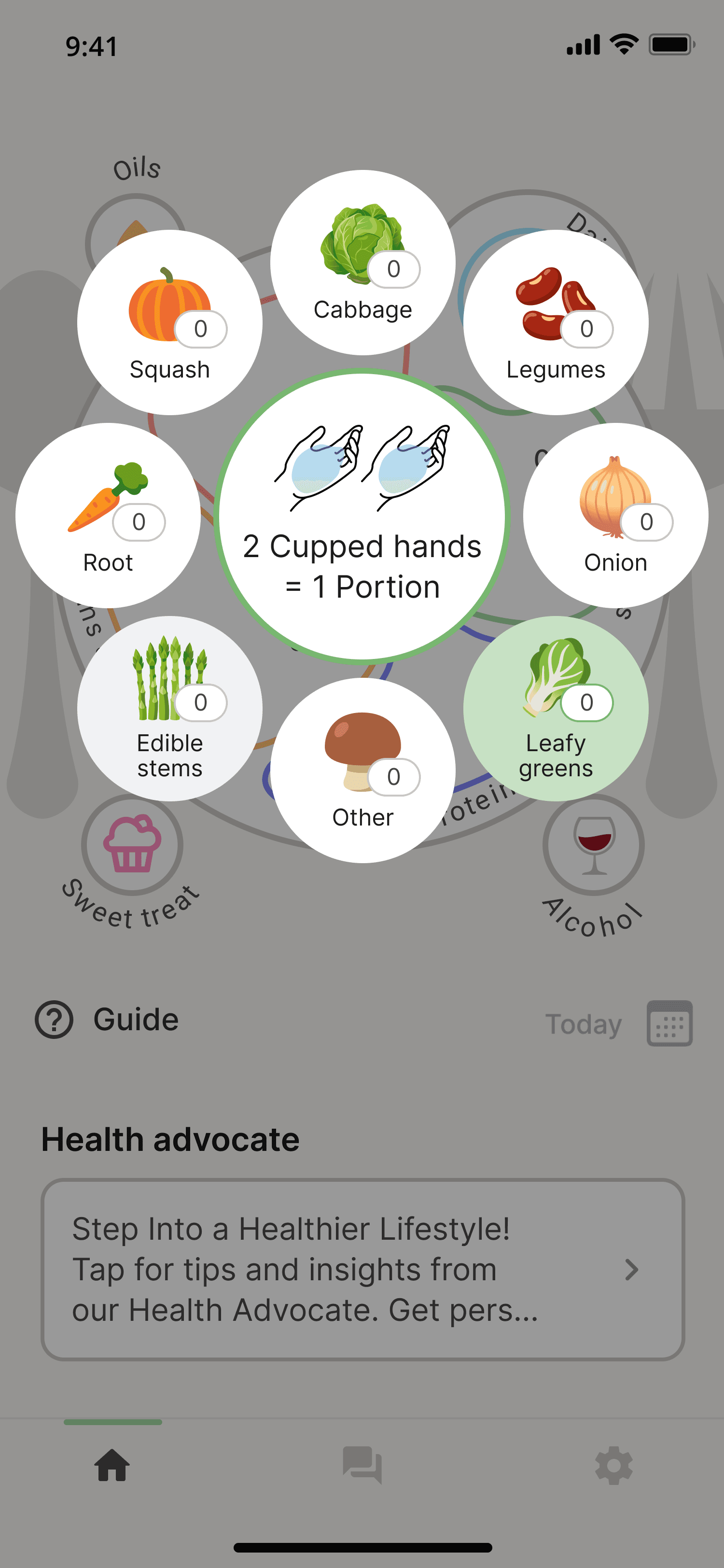
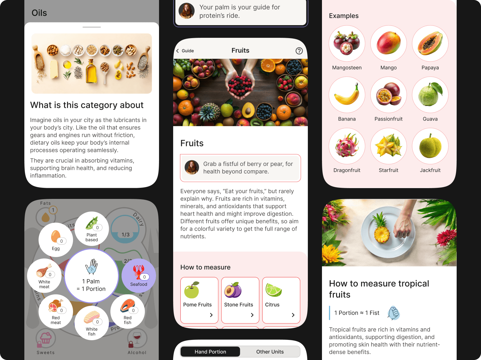
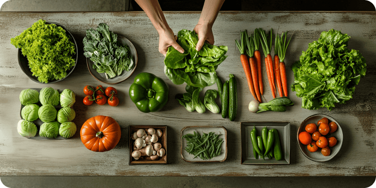
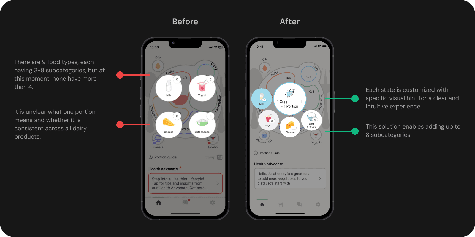
Simplified Meal Logging: Clear visuals guide food logging (fruits, vegetables).
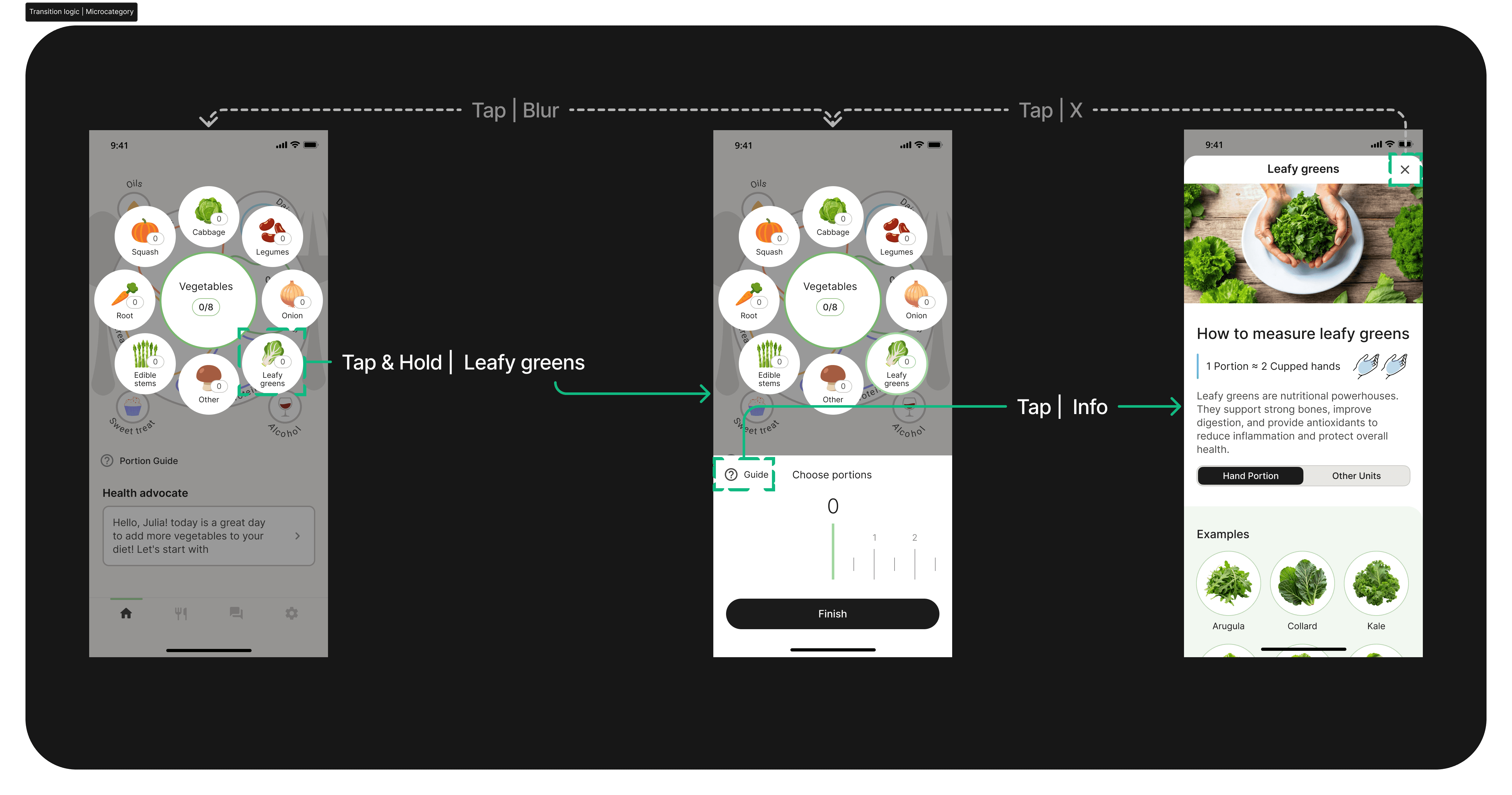
Radial Menu: Game-inspired design for easy navigation with visual portion tips.
Cooked Food Logging: Provides examples for logging cooked dishes.
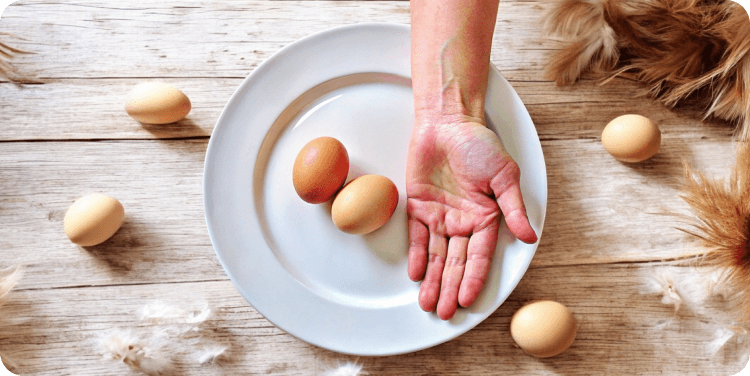
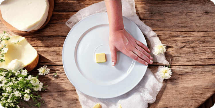
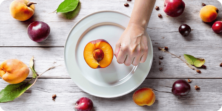
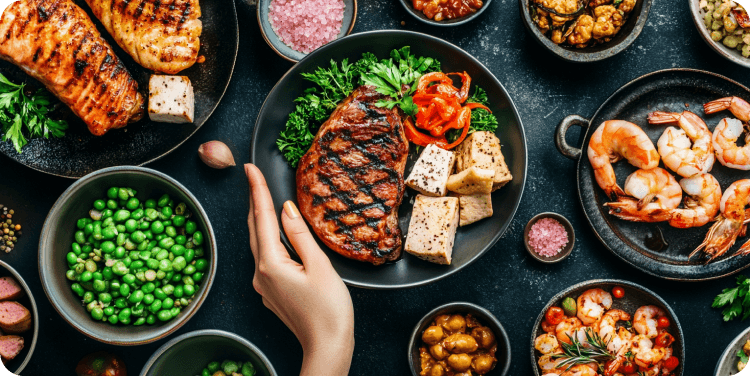
Upgraded Palm Method Guide: Replaces text-heavy portions with visual aids for accurate portion estimation and category identification.
12
Next Steps
We’ve launched a new version of the app with key updates, enhanced onboarding, and a new paywall. Next, we’ll gather feedback from users and beta testers, closely monitor analytics, and expect improvements in retention and payment conversion.
Our next focus is developing Health Advocate, a paid feature that offers personalized health advice. We’re excited to continue improving the app to better support our users on their wellness journeys.
